 Final |
|---|
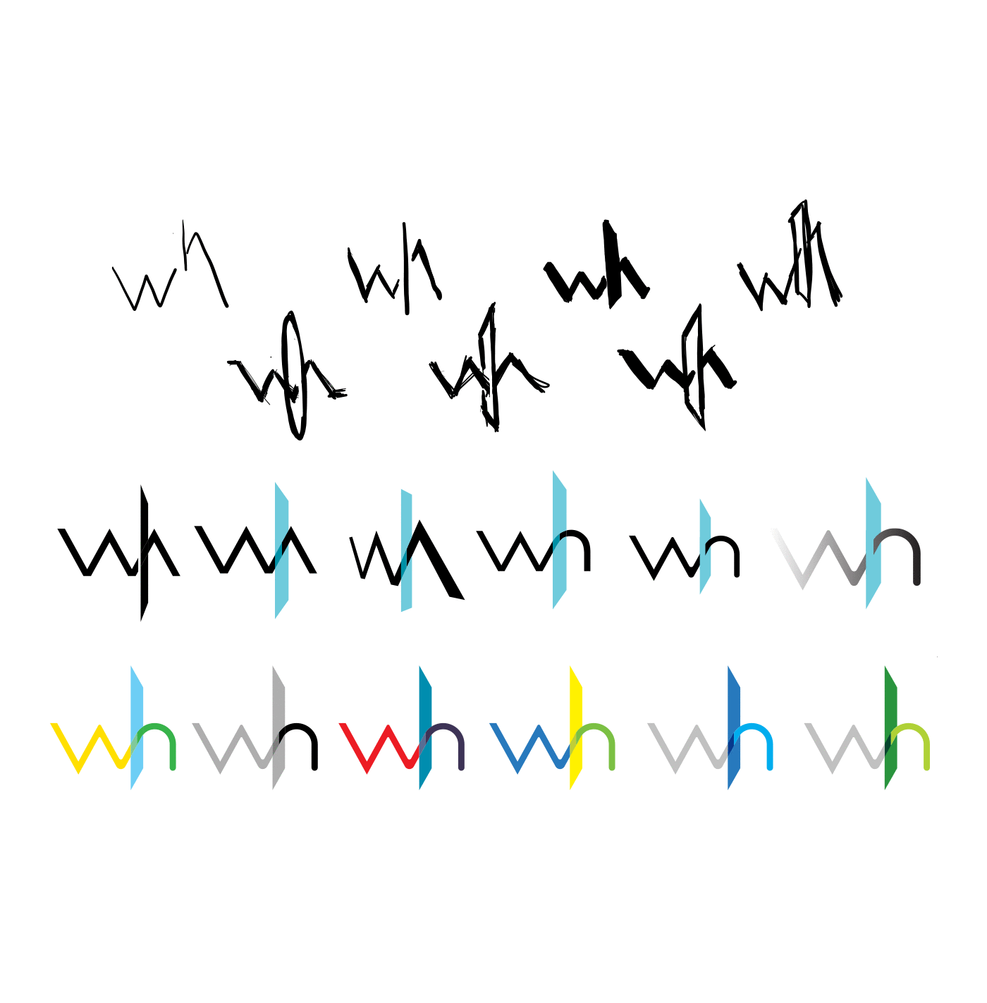
 Concept progression from sketches to final |
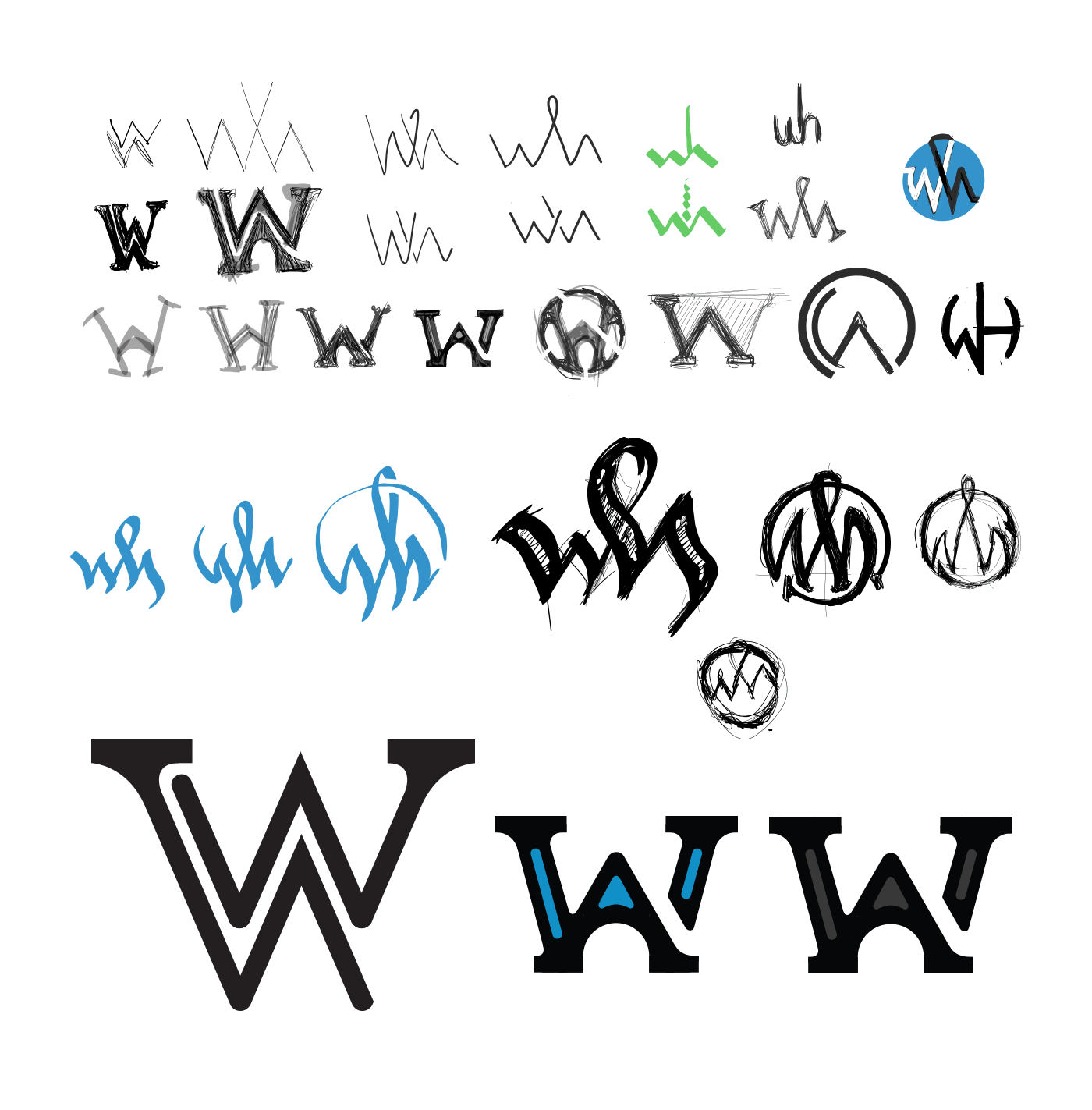
 Some of the initial digital sketches |
Personal Logo
Identity Design
About this project
The hardest thing to ever do is design for myself, as I'm the most demanding client I've ever worked with…by far!
I had been wanting to do a W-H combination for a long time, but could never quite get it right. As you can see from the sketches, the ideas started as simply seeking ways to creatively intertwine the two letterforms, but as I sketched I began to see a story unfold that truly spoke to who I am, or who I aim to be, as a designer.
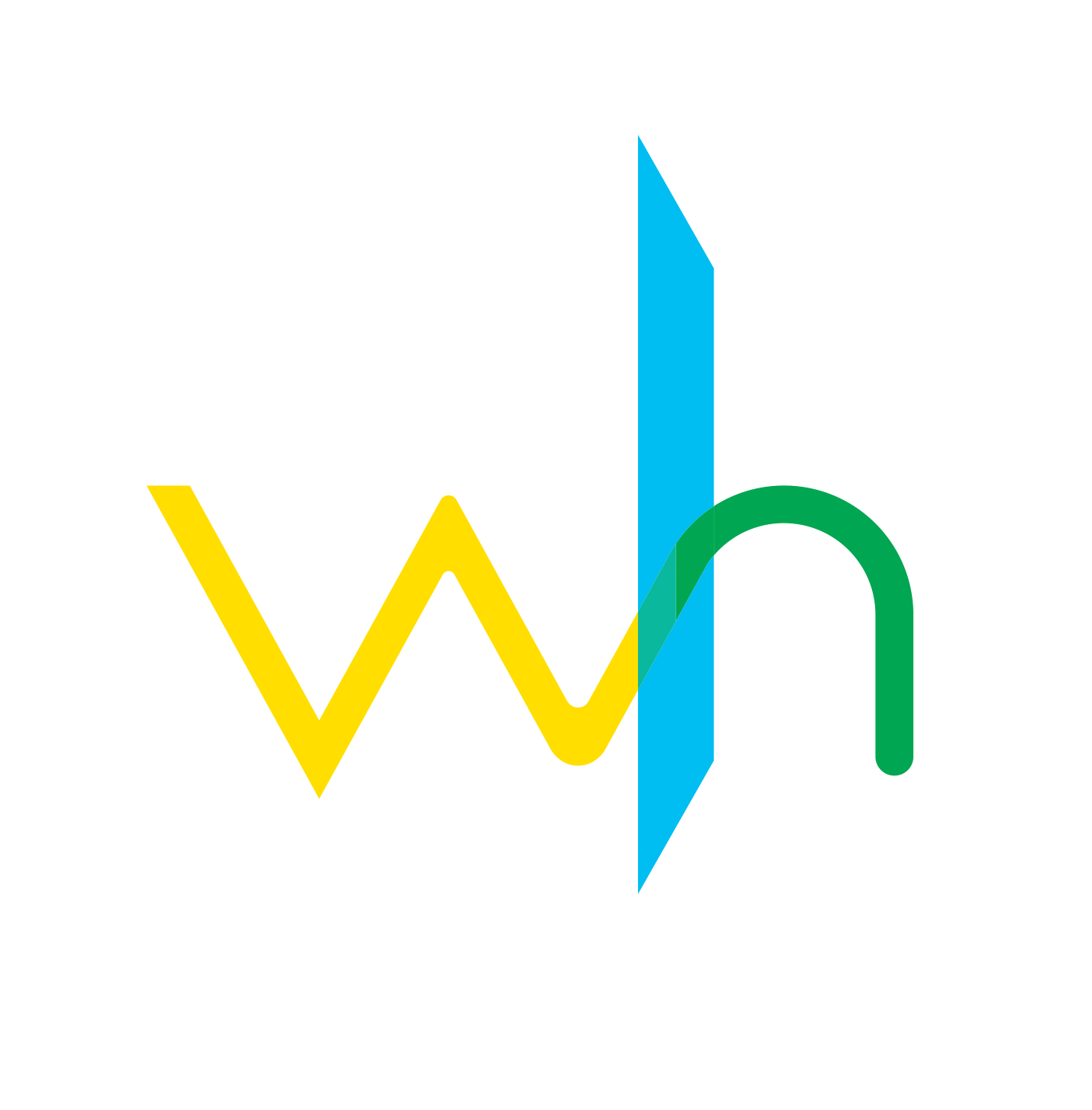
The story of the logo is very simple, subtle and abstracted, but represents a user journey (or a client journey). The letterform of the W starts out with sharp corners to represent the difficult experience a user may be having. As the journey continues, the corners begin to soften to represent the improving experience.The blue bar that forms the ascender of the letter H represents an abstract interface. It could be digital, it could be three-dimensional, etc. Regardless of the interface, once the yellow average experience mixes with the positive interface experience, the path becomes green to signify the positive end to the journey.
