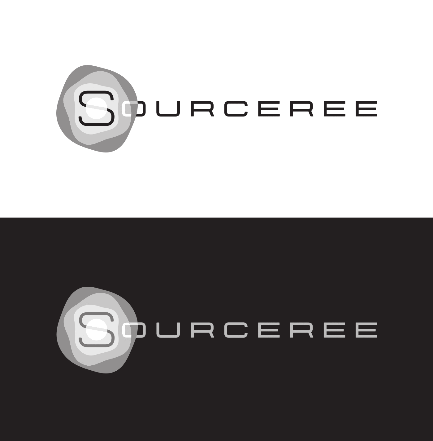
 Final Sourceree Logo - 2-Color |
|---|
 1-Color, White on Blue |
 1-Color Black & White Variants |
 Icon Version |
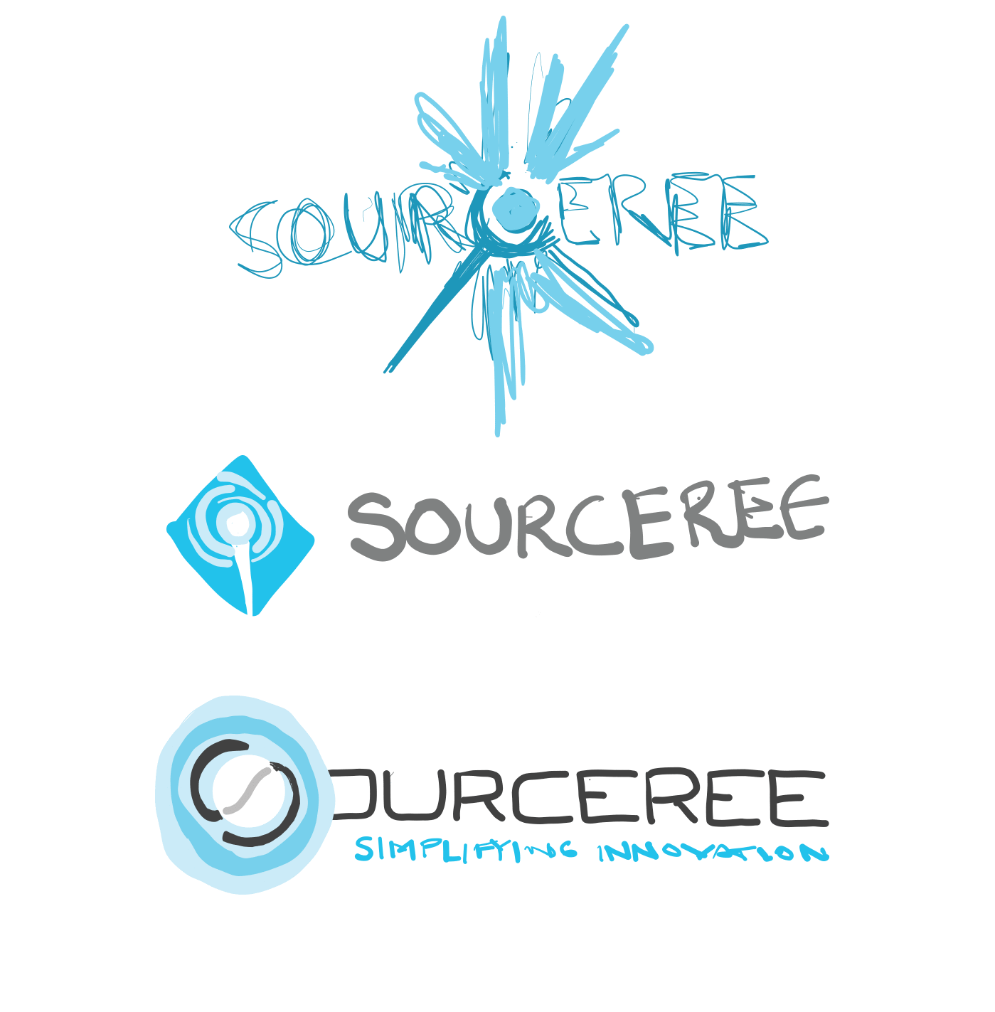
 Adobe Draw Sketches of Final Concept Progression |
Sourceree
Identity Design
About this project
I wanted to find a way to weave the sorcery concept into Sourceree's identity. The name held little meaning to what they did in the tech world, so I envisioned using the magic metaphor to provide a sense that what Sourceree could do was special…supernatural, perhaps.
On the flip side, I didn't want to make the logo too literal, so I started with looking into "sorcery" and found the common visual representation being related to wizards. From there, I started to search for elements that could have value as a logo mark. The hats…the beards…the long robes? Ultimately, I felt like the staff felt like the most iconic element of wizardry. The primary tool with which they wield their power. This quickly became the focal point of my sketches.
I looked for ways to weave the scepter into the word mark, ultimately finding the "S" to be the perfect element to hold an orb element as a focal point. I wanted to add a sense of movement to the logo by making the orb glow; to represent the flow of ideas, creation, problem solving. A sense that Sourceree could move and adapt with the ever-changing tech industry.
Using the typography to extend from the orb to create the handle was too obvious, but it worked. Working on a wider lettering instead of relying on exaggerated kerning allowed the logo to stay together as a more solid object.
Through various iterations, we arrived at the final logo (above). I wanted a streamlined font and abstract representation that could be appropriate for their industry. We tried various color combinations, but ultimately ended on a fairly safe palette. Overall, it was a simple concept, but finding the perfect weight and spacing of the glow, the lettering, and the colors made for a harder-than-expected final product.
