 Final Logo - Horizontal |
|---|
 Final Logo - Stacked |
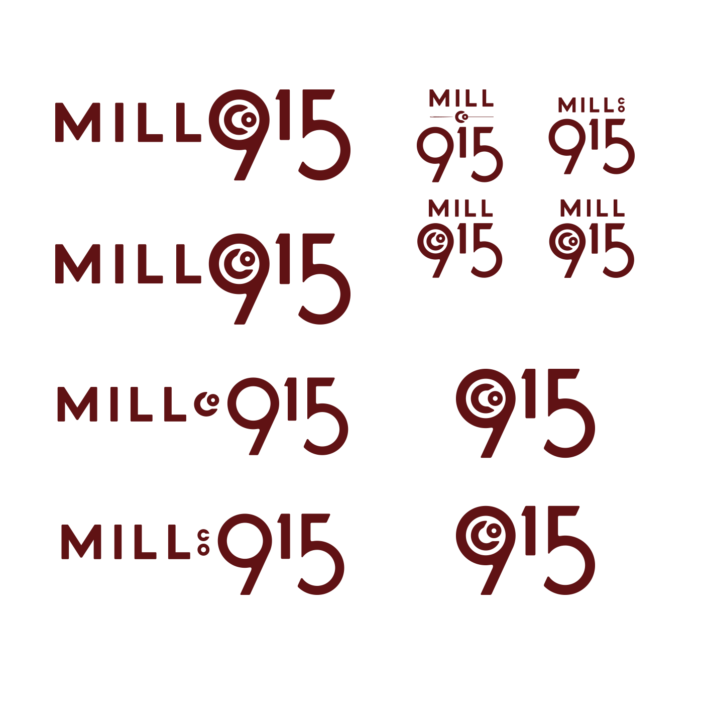
 Logo Progression |
 Initial Sketches |
Mill Co. 915
Identity Design
About this project
When approached about developing an identity for a new men’s t-shirt company out of Columbus, I wanted develop a simple logo that could provoke the idea of classic American-made quality from the industrial era and land somewhere between the world of higher-end brand identities and the handdrawn trend that has taken over just about every brand that wants to feel modern industrial.
Ultimately, my inspiration came from the machines in the old cotton mills and specifically the large wheels that spun on the machinery. I liked the idea of the motion of the wheels and spools and wanted to find a way to incorporate that into the lettering of the logo. In the end this was very subtly creates with with circles in the 9 and 5 of the logo, with the angles attempting to create a connection from the bottom of the 5 to the “wheel” in the 9, and the threat flowing down from the 9. It’s something only I would likely pick up, but everything was deliberate in the final design.
I was fascinated with the old logos stamped and molded in the old machinery, and I rounded the edges of all of the letters slightly to soften the corners a bit, as imperfections are plenty in those casts, but that was where I stopped with adding hints of imperfection, as I felt that a company that was going to launch a product that prides itself in quality needed to still feel precise and solid.
The end result feels simple and strong. Old, but modern. Soft, yet masculine. It’s also given us a style that I’ve been able to use in other lettering tasks to provide some uniqueness while still being on-brand.
